Media Ops Dashboard feature
Improving campaign discoverability and task completion for media teams
Scope
Product Design Lead
Role
UX strategy, Product design
Platform
Enterprise SaaS (Omni Platform)
The Problem
Media teams manage an abundance of campaigns across multiple channels and markets. However, the existing Media Ops interface made it difficult to quickly locate and understand critical campaign activity. The UI was strictly table based creating an overload of information and an inability to see immediate needs.
Users struggled with:
Locating critical campaigns that required action
Understanding campaigns’ most pressing needs
Navigating multiple campaign views
Campaigns were often buried within long lists, slowing down workflows and increasing operational friction.
The Opportunity
Media planners and campaign managers needed a faster way to:
Discover criticalities
Monitor campaign status
Identify campaigns the required action
The opportunity was to design a dashboard feature that surfaced key campaign information and improved campaign discoverability while offering immediate action to resolve critical needs.
Research
I focused on understanding how teams used the application during their daily work, how often they visited and how long did they stay to complete their objectives.
Through conversations with users and internal stakeholders, usability testing, workflow analysis, it became clear that teams relied on two key tasks:
Monitoring campaign status and delivery
Identifying and resolving critical issues
However, the existing interface required users to piece together information from multiple sections of the product.
Key observations included:
Frequent exiting of application
Repeated navigation between campaign views
High time-to-task when locating specific campaigns and their needs
Key Insights
Campaign discovery was too complex
Users often had to navigate multiple views or apply several filters to locate the campaigns they were looking for.
“Sometimes it takes longer to find the campaign than it does to update it.”
This influenced how we simplified the table and added filtering that would allow more accessible searches.
Users needed better status visibility
Campaign managers wanted a quick way to understand campaign status and next steps.
“I need to know which campaigns are running and which ones need attention.”
As a result we highlighted the most crucial and immediate status on landing of the application.
Required actions were easy to miss
Campaigns that required action such as approvals or updates were not clearly surfaced in the interface.
“I usually find out something needs attention when someone messages me.”
This identified the need for CTAs along with the status.
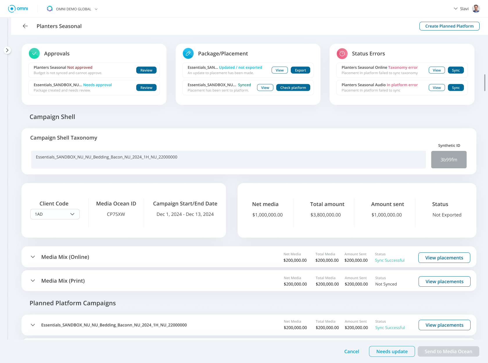
The Solution
The redesigned Media Ops dashboard introduced a centralized campaigns overview that surfaces the most relevant campaigns statuses and immediate needs.
The experience prioritized clarity, prioritization, and quick access to campaign information.
Key Features:
Campaign overview dashboard
The dashboard provides a high-level view of campaign activity allowing users to quickly understand what is happening across current campaigns.
Campaign status indicators
Clear visual indicators show campaign states. These indicators help users identify important campaigns and needed actions.
Smart campaign discovery
Campaigns are surfaced based on relevance. This helps users quickly locate the campaigns that are most critical.
Quick action
Users can jump directly from the dashboard to campaign detail pages or action, reducing navigation steps and allowing users to resolve issue or take next action.
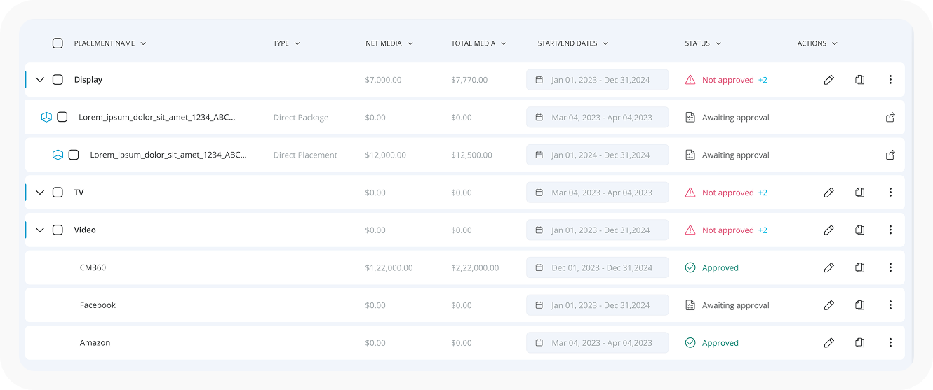
Simplifying the existing table. This made it easier to view details but did not solve the critical problem of quickly identifying immediate needs.
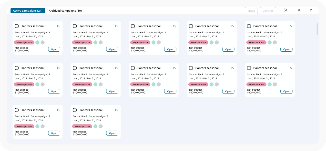
Use of cards for faster scanning. Smaller chunks of information helped especially in viewing more campaigns on the screen however, it still required searching and filtering to find critical issues.
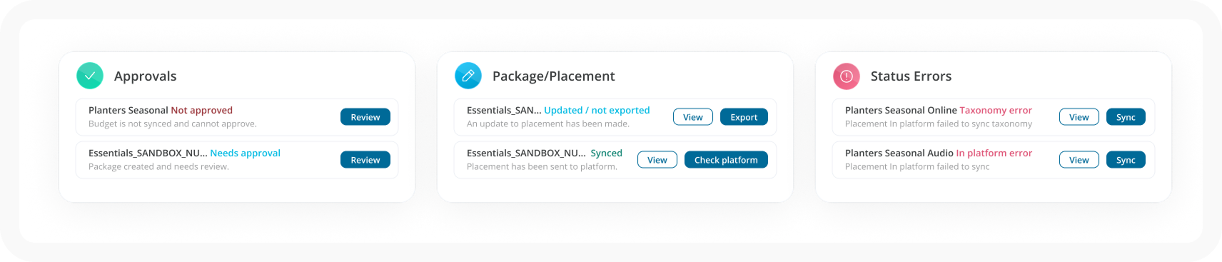
Addition of a dashboard. Creating a dashboard of critical needs, we were able to compliment the already existing table. Allowing the line items in the dashboard to provide quick action or navigation to immediate required actions. This is the feature we selected.