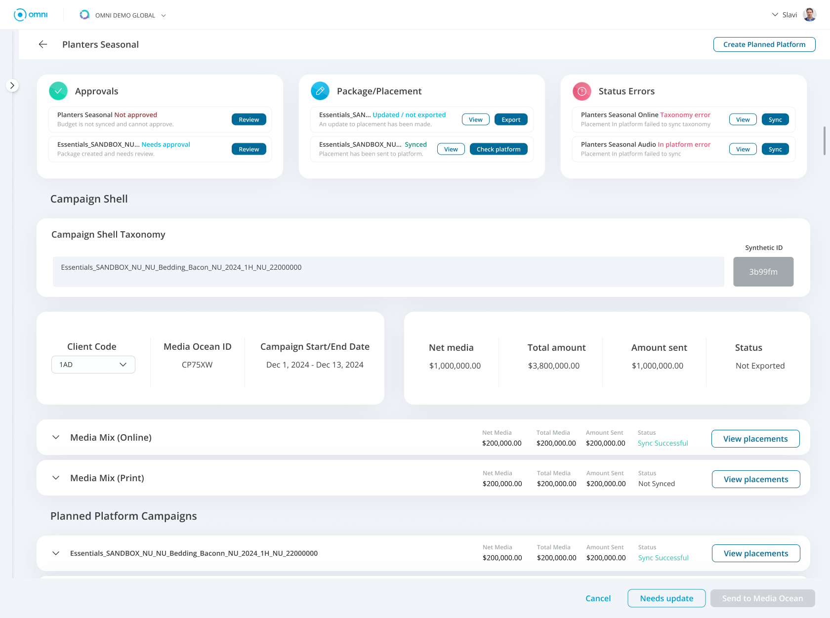
Media Ops Dashboard feature
Improving campaign discoverability and task completion for media teams
Scope
Director, UX/UI
Role
UX Strategy, Product Design, Design Leadership
Platform
Web / Enterprise SaaS
The Problem
Media Ops was designed to help teams manage campaigns, packages, placements, approvals, and other operational tasks across the campaign lifecycle.
As the amount of campaign data grew, the experience became increasingly difficult to manage.
Critical information was buried within dense tables, forcing users to search through large amounts of data to understand campaign status and identify issues.
Users faced several challenges:
Difficulty identifying campaigns that required attention
Critical information buried within dense tables
Too much time spent searching instead of taking action
Limited visibility into status and next steps
The problem wasn't simply that users needed a better way to view campaign data.
They needed a faster way to understand what required their attention.
The Opportunity
What initially appeared to be a table usability problem revealed a larger opportunity to rethink how Media Ops supported operational decision-making.
Instead of designing around the question:
“How do we help users find a campaign?”
we shifted toward:
“How do we help users immediately understand what needs attention and act on it?”
Our design goals were to:
Surface priority information earlier
Reduce the effort required to find campaigns
Make issues and status easier to understand
Create clearer paths from identifying a problem to taking action
Research
Before redesigning the experience, I worked with the team to understand how media teams were actually using Media Ops throughout their day.
Through user interviews, workflow analysis, and usability testing, we examined how users:
Located campaigns
Identified issues and incomplete tasks
Evaluated campaign status
Moved between campaign-level and detailed information
Determined what required action
The research showed that users weren't struggling because the system lacked information.
They were struggling because the experience gave too much information the same level of importance.
Key observations included:
Users typically entered Media Ops with a specific goal: understand what had changed, identify what required attention, and take action.
The existing experience made them search for those answers manually.
This reframed the problem.
Rather than continuing to optimize how campaign data was displayed, we needed to design the experience around prioritization and decision-making.
That became the foundation for the redesign.
Key Insights
Campaign discovery too much effort
Users often spent more time locating the right campaign than completing the task they came to perform.
“Sometimes it takes longer to find the campaign than it does to update it.”
Opportunity: Surface relevant campaigns and provide faster paths into frequently accessed work.
Critical issues weren't visible
Campaigns requiring action looked similar to campaigns progressing normally, forcing users to inspect information manually.
“I need to know which campaigns are running and which ones need attention.”
Opportunity: Elevate status, issues, and required actions so users can quickly determine where to focus.
Information needed hierarchy
Dense tables provided comprehensive data but made everything appear equally important.
“I usually find out something needs attention when someone messages me.”
Opportunity: Prioritize information based on what users need to understand first, then progressively reveal additional detail.
The Solution
Media Ops evolved into a more proactive operational experience that helped users quickly understand where to focus and move directly into action.
Key Features:
Priority-based dashboard
Campaign status and issues were surfaced at the highest level, helping users quickly identify where attention was needed.
Faster campaign discovery
Search, filtering, and clearer information architecture reduced the effort required to locate specific campaigns.
Direct paths to action
Users could move from identifying an issue directly into the workflow required to resolve it.
Progressive disclosure
High-priority information appeared first while detailed campaign data remained accessible when needed.
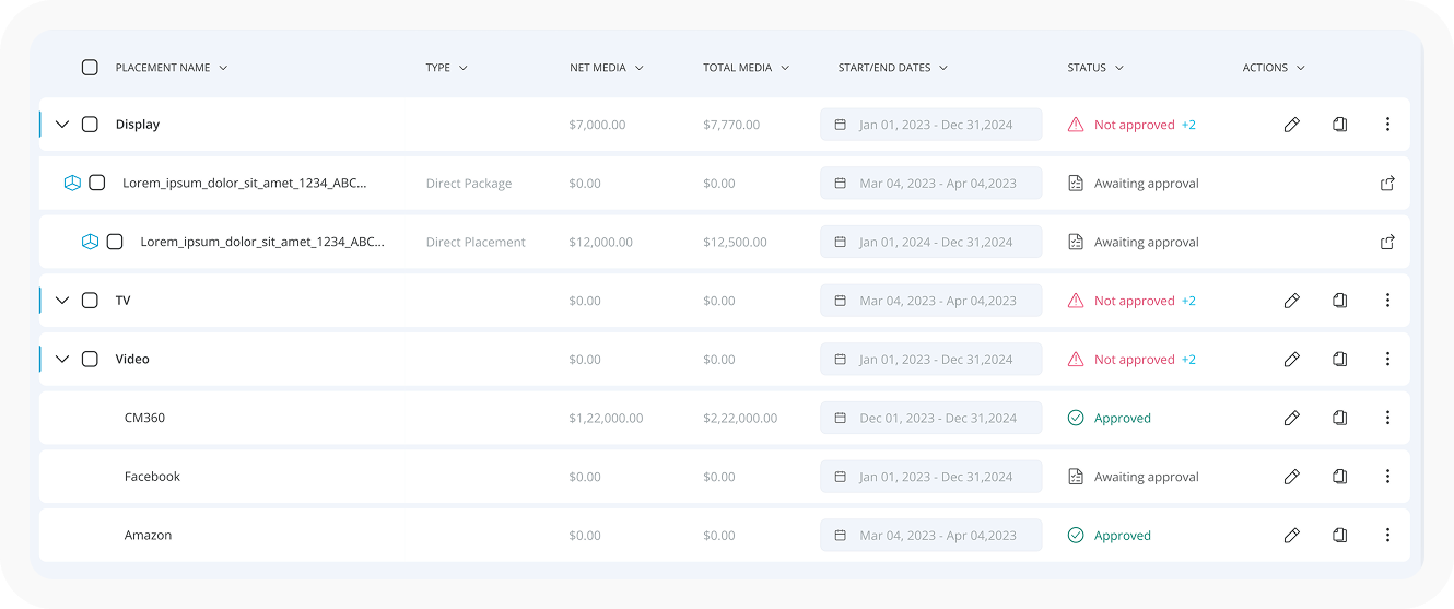
Simplifying the existing table. This made it easier to view details but did not solve the critical problem of quickly identifying immediate needs.
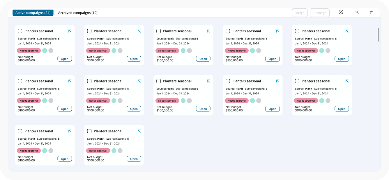
Use of cards for faster scanning. Smaller chunks of information helped especially in viewing more campaigns on the screen however, it still required searching and filtering to find critical issues.
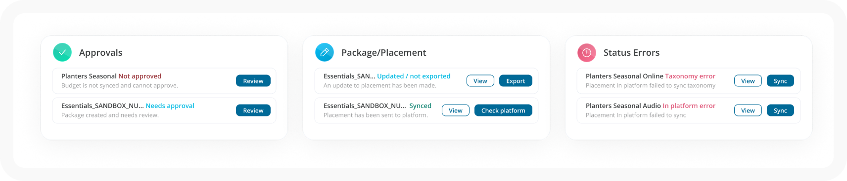
Addition of a dashboard. Creating a dashboard of critical needs, we were able to compliment the already existing table. Allowing the line items in the dashboard to provide quick action or navigation to immediate required actions. This is the feature we selected.
Designing for Operational Decision-Making
The redesign required more than improving individual screens.
I guided the experience toward a model centered on prioritization rather than information density, working with Product and Engineering to determine which information needed to surface first and how users could move more efficiently from status to action.
The patterns established through Media Ops also aligned with the broader Omni experience, creating greater consistency across navigation, hierarchy, status, and workflow behaviors.
The result was an experience designed around a simple principle:
Don't make users search for what matters. Surface it when it matters.